The Color Mistake That’s Ruining Your IKEA Hacks (And How to Fix It)
I need to be honest with you – I’ve seen some absolutely gorgeous IKEA furniture transformations completely ruined by poor color choices. And I’ve been guilty of it myself! There’s nothing more frustrating than spending hours on a hack only to realize the colors are fighting each other instead of working together.
Here’s the thing: color is probably the most important decision you’ll make in any furniture makeover, but it’s also the one people put the least thought into. They see a beautiful navy blue dresser on Pinterest and think “I want that color!” without considering how it’ll work in their actual space with their actual decor.
Let me save you from some expensive mistakes and show you how to choose colors that actually enhance your space instead of creating chaos.
Why Color Psychology Matters in Furniture
Colors aren’t just pretty – they actually affect how we feel in a space and how expensive (or cheap) things look. I’ve learned this the hard way over the years. That bright turquoise that looked so cheerful in the store? It made my whole bedroom feel like a children’s playroom. Meanwhile, a sophisticated charcoal gray instantly made the same piece look like it cost three times what I paid.
Understanding basic color relationships is like having a cheat code for making your hacks look professional and intentional.
The Color Relationships That Actually Work
Let me break down the color combinations that consistently look amazing together:
Complementary colors sit opposite each other on the color wheel – think blue and orange, or purple and yellow. These create drama and energy, but they need to be balanced carefully. I love using one as the dominant color and the other as a small accent. Maybe a deep navy dresser with warm brass hardware, or a sage green cabinet with subtle coral-toned accessories.
Analogous colors sit next to each other on the color wheel – like blue, blue-green, and green. These create harmony and feel very soothing. This is my go-to approach for bedrooms and spaces where I want calm, sophisticated vibes.
Monochromatic schemes use different shades of the same color. This is foolproof and always looks expensive. Think a light gray base with darker gray accents and white highlights. It’s subtle but incredibly sophisticated.
Neutral plus one is probably my most-used approach. Stick with neutrals (whites, grays, beiges, blacks) and add one accent color. This gives you flexibility and ensures your piece will work as your decor evolves.
Colors and Materials That Scream “High-End”
After years of experimentation, I’ve noticed certain colors and materials consistently make furniture look more expensive:
Deep, saturated colors like forest green, navy blue, charcoal gray, or rich burgundy always look sophisticated. They have weight and presence that pale colors often lack.
Classic neutrals with warm undertones – think warm whites, creamy beiges, and soft grays – feel timeless and expensive. They’re the colors you see in high-end furniture showrooms.
Natural wood tones never go out of style, especially rich walnut, warm oak, or dramatic ebony stains. Real wood grain patterns (even if it’s just a really good faux finish) add instant value perception.
Metallic accents in the right finish can elevate everything. Brushed brass, matte black, or aged bronze hardware makes any color scheme look more intentional and expensive.
Era-Specific Color Schemes That Work
Want to nail a specific design era? Here are the color combinations that actually capture those aesthetics:
Mid-Century Modern: Warm woods paired with deep teals, burnt orange, mustard yellow, or rich browns. The key is combining natural materials with those distinctive 1960s accent colors.
Scandinavian: Whites, light grays, and natural wood tones with occasional soft blues or sage greens. It’s all about that clean, airy feeling.
Industrial: Charcoal grays, deep blacks, raw metal finishes, and weathered wood. Think urban loft vibes with materials that look aged and authentic.
Traditional: Deep blues, forest greens, burgundy, and cream paired with dark wood tones. These are colors that feel established and timeless.
Contemporary: Clean whites, soft grays, and black accents with one bold pop of color – maybe a vibrant coral or deep emerald green.
The IKEA Pieces That Are Actually Worth Modifying
Here’s where I’m going to save you some serious frustration. Not all IKEA furniture is created equal when it comes to modification potential. Most of their stuff is made from particleboard or MDF with a thin veneer that doesn’t take paint or stain well.
But there are some absolute gems that are perfect for color transformations:
The Tarva bed frame is solid pine and practically begging to be customized. I’ve seen these transformed with everything from rich espresso stains to bold painted finishes. At around $179, it’s real wood that you can work with like any quality furniture piece.
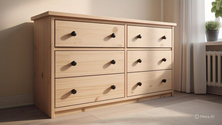
The Rast 3-drawer chest is another solid pine winner at about $50. It comes unfinished, which means you can stain it, paint it, or do anything else you can imagine. I’ve seen these turned into incredibly sophisticated pieces that look like they cost ten times the price.
The Ivar shelving system is also solid pine and modular, so you can create custom storage solutions and finish them however you want. The fact that it’s real wood means your paint and stain choices will look authentic and rich.
These pieces are special because they’re actual wood, not particleboard with a printed wood-look surface. That means your color choices will have depth and richness that you just can’t achieve with laminated surfaces.
My Color Selection Process
Here’s how I approach color selection for any project:
Start with your room’s existing colors. What colors are already working in your space? Your new piece should either complement these or serve as a planned contrast.
Consider the piece’s function. Bedroom furniture can handle more dramatic colors than pieces in high-traffic areas. A bold emerald green nightstand might be perfect, while that same color on a dining room sideboard could be overwhelming.
Think about longevity. Trendy colors are fun, but will you still love that millennial pink in five years? I usually stick with classic colors for large pieces and save the trendy choices for smaller accents.
Test in your actual lighting. Colors look completely different in different light. I always get samples and live with them for a few days before committing.
Contrast vs. Harmony: When to Use Each
This is where a lot of people get confused. High contrast (like black and white, or navy and brass) creates drama and makes pieces feel more formal and sophisticated. I use this approach when I want a piece to be a statement element in the room.
Low contrast (like different shades of gray, or cream and beige) creates harmony and makes pieces feel more integrated into the space. This works when you want functional furniture that doesn’t compete for attention.
Neither approach is right or wrong – it depends on what role you want the piece to play in your room.
Common Color Mistakes I See (And How to Avoid Them)
Using too many colors in one piece. I get it – you love all the colors. But more than three colors on one piece usually looks chaotic rather than interesting.
Ignoring undertones. That “white” paint might have pink undertones that clash with your cool gray walls. Always consider undertones when choosing colors.
Going too bold too fast. If you’re nervous about color, start with one bold accent rather than painting the whole piece. You can always add more color later.
Forgetting about hardware. The hardware finish needs to work with your chosen colors. Brass looks amazing with warm colors, black works with almost everything, chrome feels very contemporary.
My Current Favorite Combinations
Right now, I’m obsessed with warm sage green paired with natural wood and brass accents. It feels sophisticated but not cold, and it works in almost any room.
For dramatic impact, I love deep charcoal gray with warm wood tones and black hardware. It’s masculine but not harsh, and it makes everything around it look more expensive.
And for timeless appeal, you can’t beat cream white with natural wood accents and brushed brass hardware. It’s classic, sophisticated, and will work with any decor changes over the years.
The Secret to Professional-Looking Results
Want to know what makes the difference between amateur and professional-looking results? Consistency and restraint. Choose your color palette and stick with it throughout the piece. Don’t add “just one more color” because you think it needs something extra.
And remember – the goal isn’t to create the most colorful piece possible. The goal is to create something that enhances your space and looks intentional.
Ready to Create Your Perfect Color Scheme?
Choosing the right colors for your IKEA hack doesn’t have to be intimidating. With a basic understanding of color relationships and some thoughtful planning, you can create pieces that look like they were custom-designed for your space.
Remember, those solid pine pieces like the Tarva, Rast, and Ivar are your best bets for achieving rich, authentic-looking color results. Real wood takes stain and paint in a way that particleboard just can’t match, and at these prices, you’re getting incredible value for quality materials.
Ready to bring your color vision to life? Explore our curated collection of legs, knobs, peel and stick wallpapers, overlays, and 3D panels to complement your perfect color scheme. Plus, browse our inspiration gallery and color combination guides to help you create furniture that looks custom-designed for your space. Your dream makeover starts with the right colors – let’s make it happen!
